Website redesign before and after, from sites I rebuilt.
A screenshot comparison only shows the paint. These are real Kentucky rebuilds, described the way an owner would judge them: what the old site could not do, what the new one does, and what was kept so nothing it had earned was lost.
Or call or text (502) 387-1142


Websites I have built for Kentucky businesses


















The short answer
A good website redesign before and after is not a prettier homepage. It is a site that answers the visitor’s question faster, works on the phone the customer is holding and leads to one clear next step, while keeping the addresses, content and identity the old site earned.
Below are rebuilds I did in 2026, each described by what changed and what it kept. Where the right answer was a refresh or a fix under the hood instead of a redesign, I say so, because that is part of the job too.
What to look at in a website redesign before and after
Most before and after galleries put two screenshots side by side. That tells you the new site looks newer. It does not tell you whether it works better. When you look at a redesign, mine or anyone’s, check five things:
- The job. Can a stranger tell what the business does, and what to do next, within one screen?
- The structure. Does each service, product line or common question have its own page, or is everything crammed onto one?
- The phone. Is the phone layout composed for a hand, or is it the desktop page shrunk?
- The next step. Is there one obvious action, a call, a request or a booking, on every page?
- What was kept. Did the old addresses, the content that ranked and the business’s identity survive? A redesign that loses those is a restart with a nicer coat of paint.
Arrow Aerial: one page became fifteen
Before: Arrow Aerial, my construction drone brand, was a single page. It could mention progress photography, mapping and coverage, but it could only gesture at the four questions a contractor asks before calling: what gets captured, how often, how fast it is delivered, and whether the pilot has done jobs like theirs.
After: a fifteen-page site, live September 28, 2026. Services are written for contractors and developers. Eight project stories carry the client, location, schedule and deliverables. A drag-to-compare view shows two drone maps of the Louisville VA Medical Center site, months apart. A coverage map puts an orange dot on every place with published work, and the proposal form opens only the questions that apply to the service picked.
What it teaches: when a business sells something specialized, the redesign is mostly structure. Give each buyer question its own page and the site starts doing the explaining. Read the Arrow Aerial case study.
Lakeside Oasis RV Park: a drawing became a map guests can use
Before: the park’s map was a drawing: rows of numbered pads, the pond and the entrance. Useful at the office counter, less useful to a guest trying to picture which site to ask for.
After: the September 2026 redesign brought large photography, a clear teal and orange identity, plain rates and an interactive map of all 51 sites, numbered 501 through 551. Type a number or tap a site and it highlights with its details alongside. The aerial photograph and the original drawing are one tap away, the map downloads as a JPG or PDF for the drive, and a button carries the site number straight into the reservation inquiry.
What it kept: the original drawing is still on the site, and the map says plainly that selecting a site is not a reservation. The office still confirms every stay. See the Lakeside Oasis project.
Lucas Play: 1,374 products kept, everything around them replaced
Before: an older WooCommerce store had grown to 1,374 listings, most of them already sold. Collectors arrived looking for one LEGO set or one 1980s figure and met a long grid of mostly sold items.
After: every product, all 1,763 photos and every category came across, keyed to the original listings and counted before launch. The new store sorts available pieces first, keeps sold ones in a browsable archive, adds a page for each decade from the 1970s on, and gives collectors a want list for the piece they are hunting. Every listing got rewritten copy, its own SEO title and alt text on its photos. Before the October 10, 2026 launch, all 1,486 addresses in the new sitemap were crawled and every one answered.
What it teaches: in a store redesign, the catalog is the asset. Move it whole, then rebuild the shopping around it. Read the Lucas Play case study.
Dr. Stephanie Moore: from a compromised site to a professional home
Before: Dr. Moore’s previous website had been compromised. Spam was showing up under her name in Google, and the site people did reach said nothing about who she is now: a transplant cardiologist, educator and speaker.
After: I rebuilt it from the identity up and launched it on September 17, 2026. A serif name with a gold MD, a navy, cream and gold palette, seven pages with one job each, and a biography, CV and media kit as proper PDFs. Media, speaking and consulting each have a direct path, with plain words that these are not patient appointments.
Underneath: legacy addresses were redirected, known spam addresses answer 410 Gone so Google can drop them, as Google’s status code guide describes, the login is locked to the edge network, backups run on a schedule, and the sitemap and analytics went live on launch night. Search cleanup from the earlier compromise is a separate, ongoing process, so I do not claim ranking gains for it. Read the full rebuild.
Field of Screams Kentucky: replacing my own first site
Before: I built Field of Screams Kentucky its first website more than five years ago. It carried the attraction through several seasons, tuned for the October nights when everyone shows up at once.
After: a ground-up redesign for the 2026 season. Background films I shot at the attraction run behind every core page, with still posters for phones and for visitors who prefer reduced motion. Eight visitor pages follow the order people plan a night out. The gallery holds 78 deduplicated photographs, an archive shows 25 annual corn-maze designs, and an opening-night countdown knows whether it is pre-season, mid-season or off-season. The site moved to my dedicated server, and all 23 sitemap addresses were checked there before the old hosting was retired.
What it teaches: a redesign is not an admission that the first site failed. Businesses change, phones change, and the site has to catch up. See the Field of Screams redesign.
Cardinal Wings and Vendome: when the business outgrew the site
Cardinal Wings Aviation came to me with a site that undersold a serious flight school at Bowman Field in Louisville. The redesign put flight training, aircraft rental and the planes themselves up front, with a clear path for each kind of student and the discovery flight never more than a tap away. The aircraft photography is mine, shot on the ramp, so none of it is stock. Read the Cardinal Wings case study.
Vendome Copper & Brass Works is the rare before and after where both sites are mine. The first site I built for the Louisville still maker did its years of service. The second, built from the ground up, gives every equipment line its own page and replaces a cart with a detailed request-a-quote form that captures process, capacity, materials and timeline before an engineer picks up the phone. Read the Vendome case study.
When the after is not a redesign
Some of my favorite before and afters changed almost nothing a visitor would notice at first glance.
- Todd Lewis Law kept its clean design. In September 2026 it moved onto my dedicated server behind Cloudflare: homepage weight went from 4.7 MB to 1.3 MB, homepage response from as much as 1.95 seconds to 0.16, and all 41 pages were verified before the old account was set aside. See the Todd Lewis Law project.
- Lakeside Boat Storage needed a refresh, not a rebuild: the same navy and gold identity, new aerial photographs in the slider and gallery, a four-minute video tour, four bay sizes with annual pricing in one grid, and a call button in the header of every page. See the refresh.
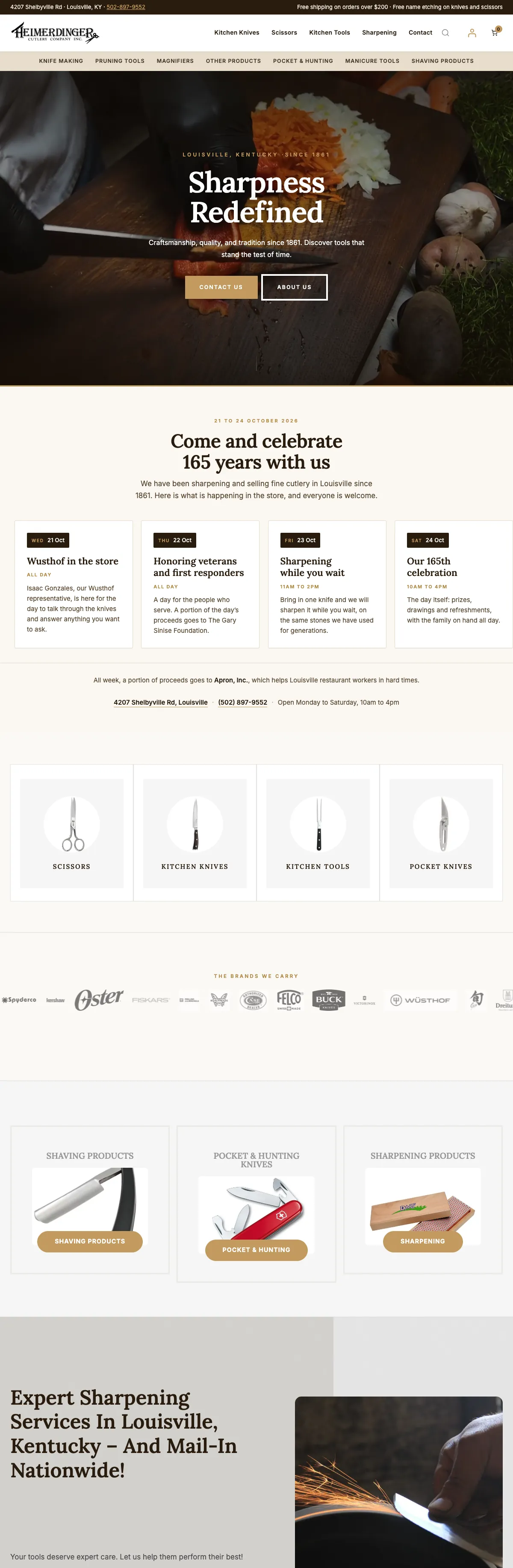
- Heimerdinger Cutlery, a store I built, got a second phase instead of a redesign: category pages that explain a range before listing it, a gallery that magnifies the real product photo, a cart drawer that reads the live free-shipping threshold, a sharpening services page and 149 new category heroes. See phase two.
- Old Mill Venue arrived with inquiry notifications landing in spam. The fix was email authentication, a photo library cut from 274 MB to 189 MB, titles written for Louisville couples and a restyled inquiry form, not a new design.
If your site is close to working, read the details that move an established website forward before you pay for a rebuild.
The part of a redesign a screenshot cannot show
What survives matters as much as what changes. On a redesign I list every address on the old site first, keep the ones that earn traffic where they are, and redirect the rest one to one to the page that replaces them, the URL mapping step in Google’s site move guide. Content that answered real questions comes across and gets better rather than shorter. The launch is checked with a crawl, not a glance, and Search Console gets watched for the weeks after.
That is how a site can change everything a visitor sees without throwing away what Google already knows about it. The full checklist is in what happens to your rankings in a website redesign, and the service itself is website redesign.
Frequently asked questions
What should a website redesign before and after show?
The job the site does, not only how it looks. Compare how fast a stranger understands the business, whether each service has its own page, how the phone layout works, whether there is one clear next step, and what was kept from the old site.
Will a website redesign lose my Google rankings?
It does not have to. Rankings drop when addresses break, content that ranked is cut, or a staging setting goes live. Keep the addresses that earn traffic, redirect the rest one to one, and check the launch with a crawl.
Do I need a full redesign or just a refresh?
If customers recognize the site, the structure still fits and the platform is current, a refresh or a set of improvements is usually enough. If the identity, the structure or the platform is holding the business back, that is a redesign. I will tell you which one I see.
Can you redesign a site somebody else built?
Yes. Most redesigns start that way. The first step is reading how the current site was put together, what it ranks for and what has to be carried over.
Will my site be down during the redesign?
No. The new site is built on a private staging copy while the current one keeps working, and launch is a controlled switch.
How long does a website redesign take?
Scope sets the schedule. You get a date before work starts and a private staging link the whole way through, and nothing goes live until you approve it.
Lucas Play on a desk, a product page and a phone.
Current captures of the live store, nothing redrawn: the homepage, a product page with its details card of maker, line, year, item number and condition, and the phone layout with its sticky buy bar.
The owner adds pieces, marks them sold and writes journal posts in WordPress without calling a developer, which was as much a part of the brief as the look.


Site 540, selected, with its details alongside.
This is the Lakeside Oasis park map at 1440 pixels with one site chosen: highlighted in orange, described in the side panel, and one button away from a reservation inquiry that already knows the number.
On a phone the same map pinches to zoom and drags to pan, because many guests look it up at the marina.
Tell me what your current site gets wrong.
Send me the address and what bothers you about it. I will tell you honestly whether it needs a redesign, a refresh or a fix under the hood, from the person who would do the work.