The details that move an established website forward.
Not every website needs a redesign. Many need a next chapter: a refined style, a better structure for what people are looking for, and a few details that make the site more useful once someone is inside it. Written from the phase-two work on Heimerdinger Cutlery, a website Shaun Wilson Designs built and still improves.
Or call (502) 387-1142Or text (502) 387-1142About six minutes
Owners of a working website that could do more
Shaun Wilson
September 20, 2026

An established site carries the identity of the business. Build on it.
A website that has been live for years carries the identity of the business and the work already invested in it. Customers recognize it. Search engines know it. Throwing that away for a fresh start is sometimes right, and often not.
A new phase gives you the chance to build on that foundation with improvements that suit how the business and its customers actually use the site. The examples below come from Heimerdinger Cutlery, a Louisville cutlery store whose website I built and have kept developing since.
What moves a working website forward.
Six details, each with a specific job. None of them requires starting over.
Carry the style across the whole experience
The palette, the typography and the logo should read the same on the homepage, deep in a category, and on a phone. A visitor who finds you on one device and returns on another should meet the same business.
Give a specialist range a structure
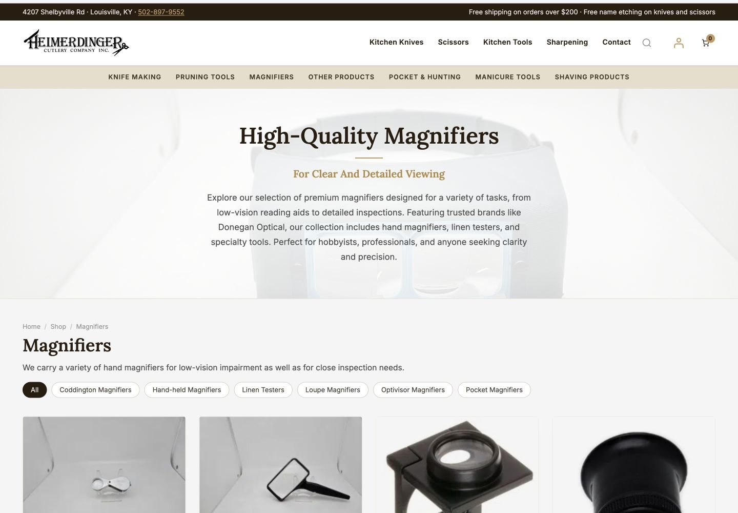
Category introductions, subcategory links and navigation chips create useful routes through a range. Connect the explanation to the next available choice instead of treating every category as an isolated grid.
Let product imagery do more work
A gallery with thumbnails and a click-to-inspect view lets people examine the actual product photograph. Use the real images; a magnified source photo is worth more than a polished substitute.
Connect browsing with the next step
A cart drawer that shows how far the customer is from free shipping and suggests what goes well with the item connects a product choice to the next stage of the visit. Read the threshold from the store settings so the copy never drifts.
Give services their own place
A retailer’s expertise extends past the shelves. Sharpening, repairs, fitting, consultations: give them a page with the same visual character and their own inquiry form.
Keep the imagery consistent at scale
Category heroes that share a mood and product photos cleaned to one framing standard make a thousand products read as one store. This is slow work, and it shows.
Refine what is working. Replace only what is not.
The familiar identity stays. The structure, the details and the help inside the site are what evolve.
Style that carries, structure that guides.
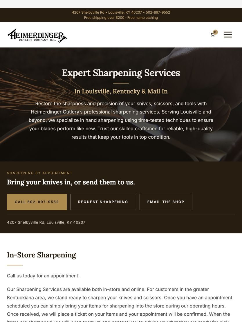
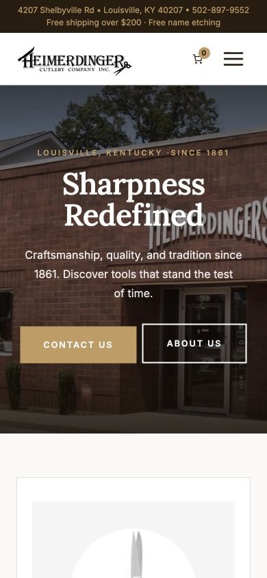
Heimerdinger’s warm neutrals, rich brown tones and distinctive typography give the store a coherent presentation from the homepage into every category and service page, and the layout adapts on tablet and phone without shrinking the desktop page.
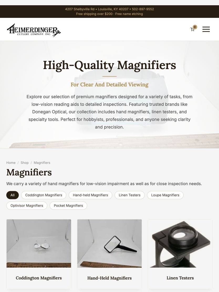
On the Magnifiers pages, a category introduction, subcategory links and navigation chips let a shopper who knows the exact type move straight to it, while someone still exploring can understand the range first.
Imagery that invites a closer look, and a cart that explains itself.
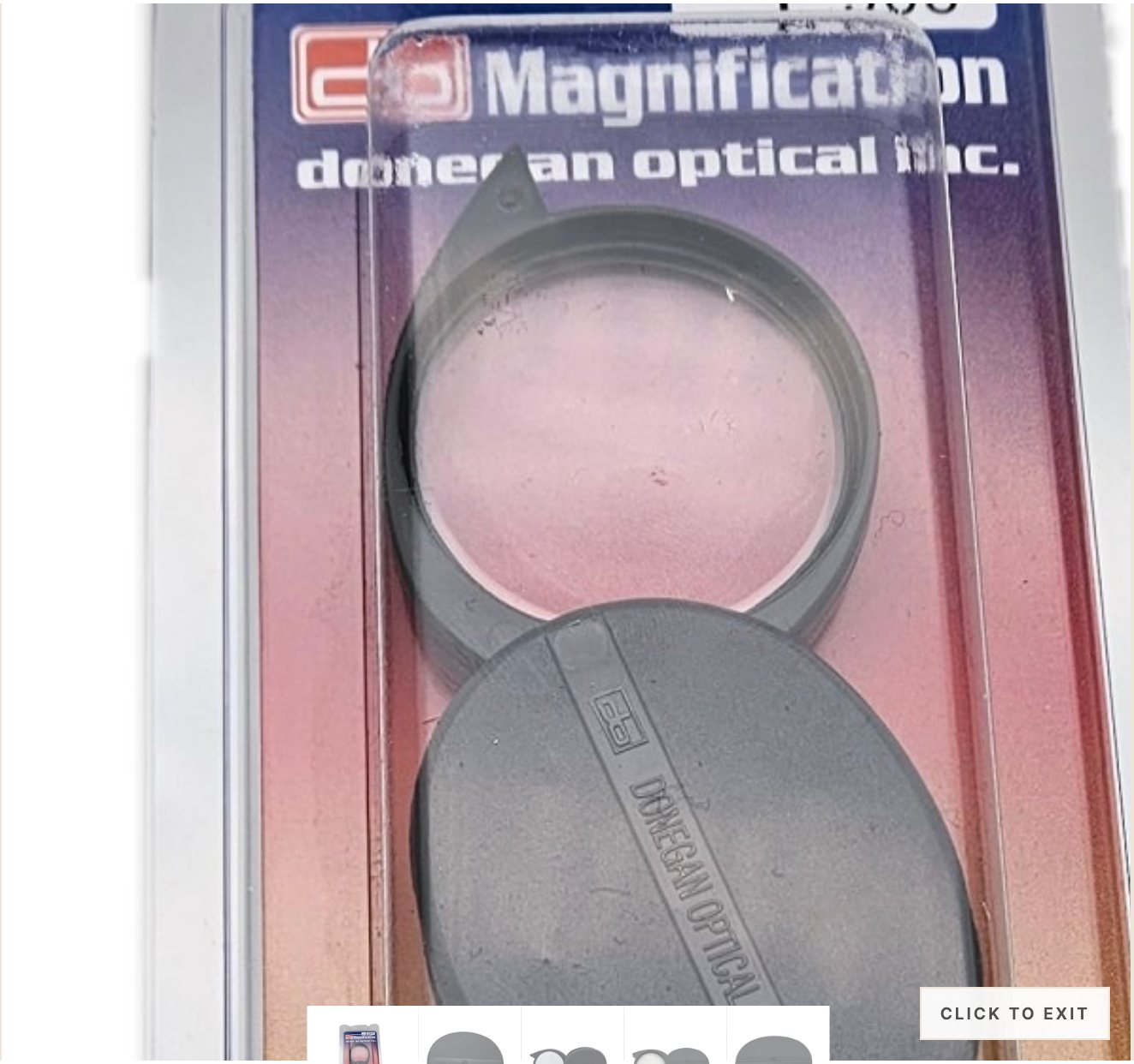
The product gallery and image inspector give real product photographs a clear place in the shopping experience. The magnified view is the source image, not new product art.
The custom cart drawer wraps WooCommerce’s native mini-cart with a free-shipping progress message and product suggestions. It is a small part of the interface that connects a product choice with the next stage of the visit. No sales-lift claim is attached to it.
Room for the services, and discipline in the imagery.
Heimerdinger’s sharpening page presents the service and its inquiry options in a dedicated layout with the same visual character as the rest of the site. That is one more way an established site grows: making room for the full business.
Behind the scenes, 149 subcategories received atmospheric hero imagery and the Pocket Magnifiers range had every product image cleaned at the source pixels with consistent framing. Nobody notices this work directly. Everybody notices when it is missing.
Good design lives in the details.
6
details, none of which needed a redesign
149
category heroes added in one pass
1
identity, carried across every screen
0
pages thrown away to get here
Before you decide between improving and rebuilding.
How do I know whether to improve or redesign?
If customers recognize the site, the structure still fits the business and the platform is current, improve it. If the identity no longer fits, the structure fights the content, or the platform is holding you back, that is a redesign conversation, and I say which one it is.
Will improvements hurt my search rankings?
Refinements to style, structure and product detail keep every URL in place. Nothing here involves moving pages. A redesign that changes URLs needs a redirect plan; a phase like this does not.
Can you do this on a site someone else built?
Yes, after a look at how it was built. The Heimerdinger phase was faster because I built the original and knew every corner of it. On a site I did not build, the first step is understanding it.
What does a phase like this cost?
It depends on the details you choose. I scope each one as a separate piece of work with its own estimate, so you can do them in order rather than all at once.
Heimerdinger Cutlery on a desk, and in a hand.
Read the Heimerdinger phase two case study, the original build, or see how I approach website redesign when a fresh start is the right call.


Tell me what your website could do better.
One conversation, one builder, a list of specific improvements in the order they matter. The person you brief is the person who does the work.