Heimerdinger Cutlery, phase two: Familiar craftsmanship, refined online. The next chapter of a site I built.
Shaun Wilson Designs built the Heimerdinger Cutlery website and has run it since. This phase carries it forward: a refined visual style, a more useful way through a specialist catalogue, product details worth a closer look, a custom cart drawer, and a proper home for the sharpening services. Same business, same identity, more depth. The original build has its own case study.
Or call (502) 387-1142Or text (502) 387-1142Heimerdinger Cutlery, Louisville, family owned since 1861
Website built by Shaun Wilson Designs; hosted, maintained and improved continuously
Responsive header and mega menus, category templates, product gallery and inspector, cart drawer, sharpening services page, category imagery, product photo cleanup
WooCommerce on Kadence, live through September 2026
An established website is a foundation, not a starting point.
An established website carries the identity of the business and the work already invested in it. Heimerdinger has served Louisville since 1861, sells roughly a thousand products across 176 categories, and sharpens what it sells. The site I built for that business did its job. This phase is about doing it better.
Working on a website over time gives a designer a deeper understanding of its identity, its content and its practical needs. So the improvements here are specific: a category page that explains a range before it lists it, a product gallery that invites a closer look, a cart that tells you how far you are from free shipping, and a sharpening page that treats the service with the same care as the shop.
The character stays. The warm neutrals, the dark brown, the brass tones and the distinctive typography are the same identity customers already know. What changed is how much the site helps once you are inside it.
Exact screens, not mockups.
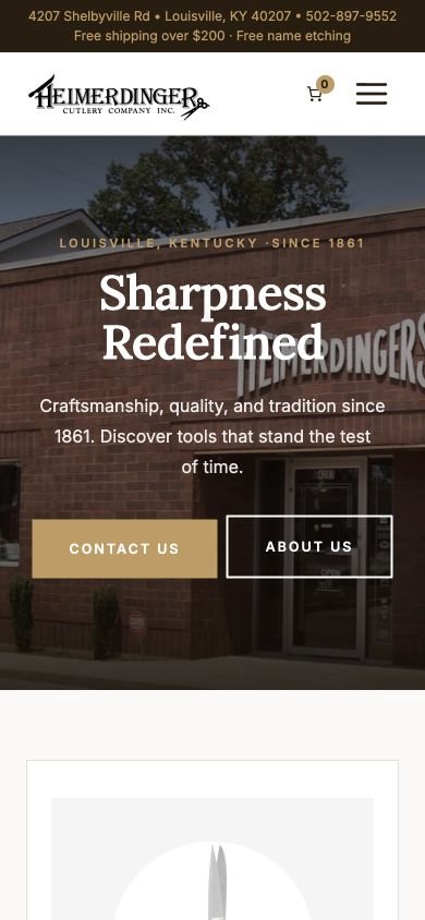
These are direct browser captures of the live site at 1440 and 390 pixels. Nothing redrawn, nothing staged.

The work, piece by piece.
Responsive header and mega menus
A header that carries the main shopping and service paths across desktop, tablet and phone, with mega menus for a catalogue this deep and a mobile menu that puts the collection one tap away.
Category templates with a job
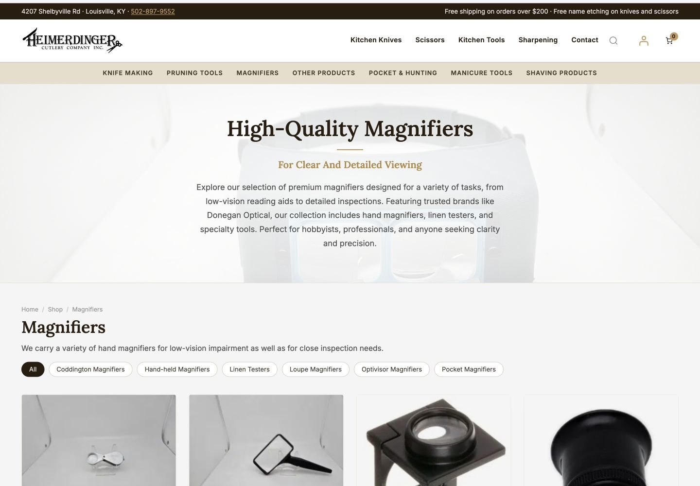
Each category opens with an introduction, links to its subcategories and navigation chips between related types, so a magnifier shopper can move from the range to the exact tool.
Product gallery and image inspector
Thumbnail views and a click-to-inspect presentation that magnifies the actual product photograph rather than a substitute.
A custom cart drawer
WooCommerce’s own mini-cart inside a drawer I designed, with a free-shipping progress message that reads the live threshold and product suggestions under Goes Well With.
Sharpening services, properly presented
A dedicated page for the sharpening business with service information and its own inquiry form, styled as part of the same website family.
Category imagery and product photo cleanup
149 atmospheric category heroes across the subcategory tree, and a source-pixel cleanup of every Pocket Magnifiers product image with consistent framing.
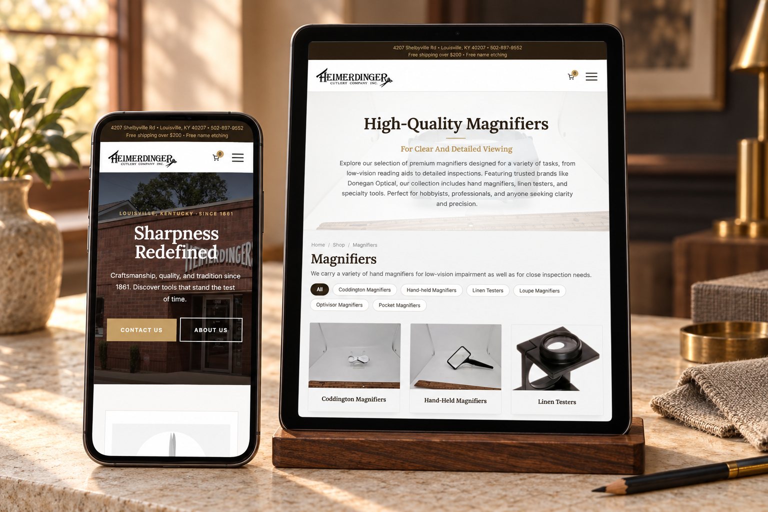
Built for every screen it will meet.
149
category heroes live across the subcategory tree
44
Pocket Magnifiers product images cleaned and reframed
1
cart drawer that reads the real free-shipping threshold, not a typed number
3
screen widths checked: 1440, 834 and 390 pixels
The same store, with more help inside it.
Heimerdinger’s customers meet the identity they already know, then find more useful routes through the range, product imagery they can examine, a cart that explains itself, and a clear place for sharpening. The underlying commerce platform keeps doing its established job; my contribution is the presentation and the behavior around it.
There are no conversion, revenue or ranking figures on this page, because none have been measured for this phase. What it shows is a continuing design relationship and the specific work it produced.
A familiar brand. A fresh chapter.
Same craftsmanship. Refined presentation.
The identity customers recognize, carried onto every screen with more useful detail behind it.
Six refinements, and why each one earned its place.
Explain the range, then hand over the choice.
A specialist retailer needs more than a single shop grid. The Magnifiers category opens with what the range is for, lists its subcategories, and offers navigation chips between Coddington, hand-held, linen testers, loupes, Optivisor and pocket magnifiers.
Someone who knows the type they need moves straight to it. Someone still exploring reads first. The design connects the explanation to the next available choice instead of treating every category as an isolated page.
Give each product room to be seen.
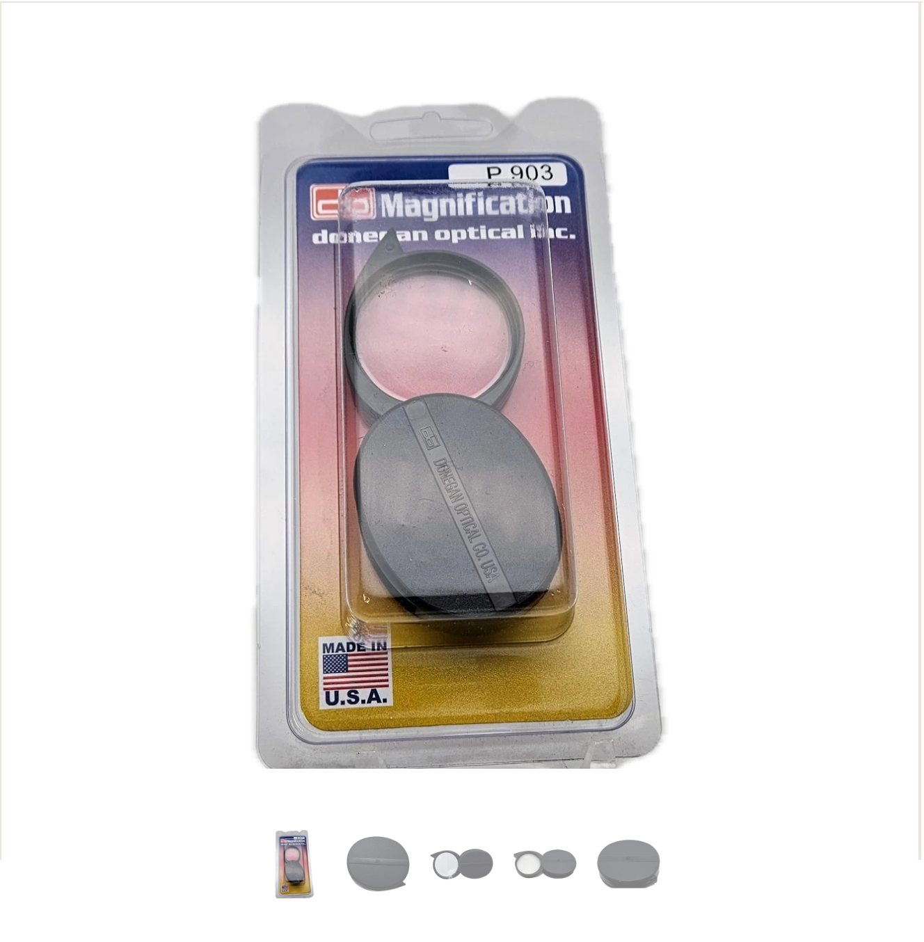
The product gallery offers thumbnail views and a clear main image with the real product photograph. It sits beside the buy column and travels with the customer down the page, so the picture is never out of reach while they read.
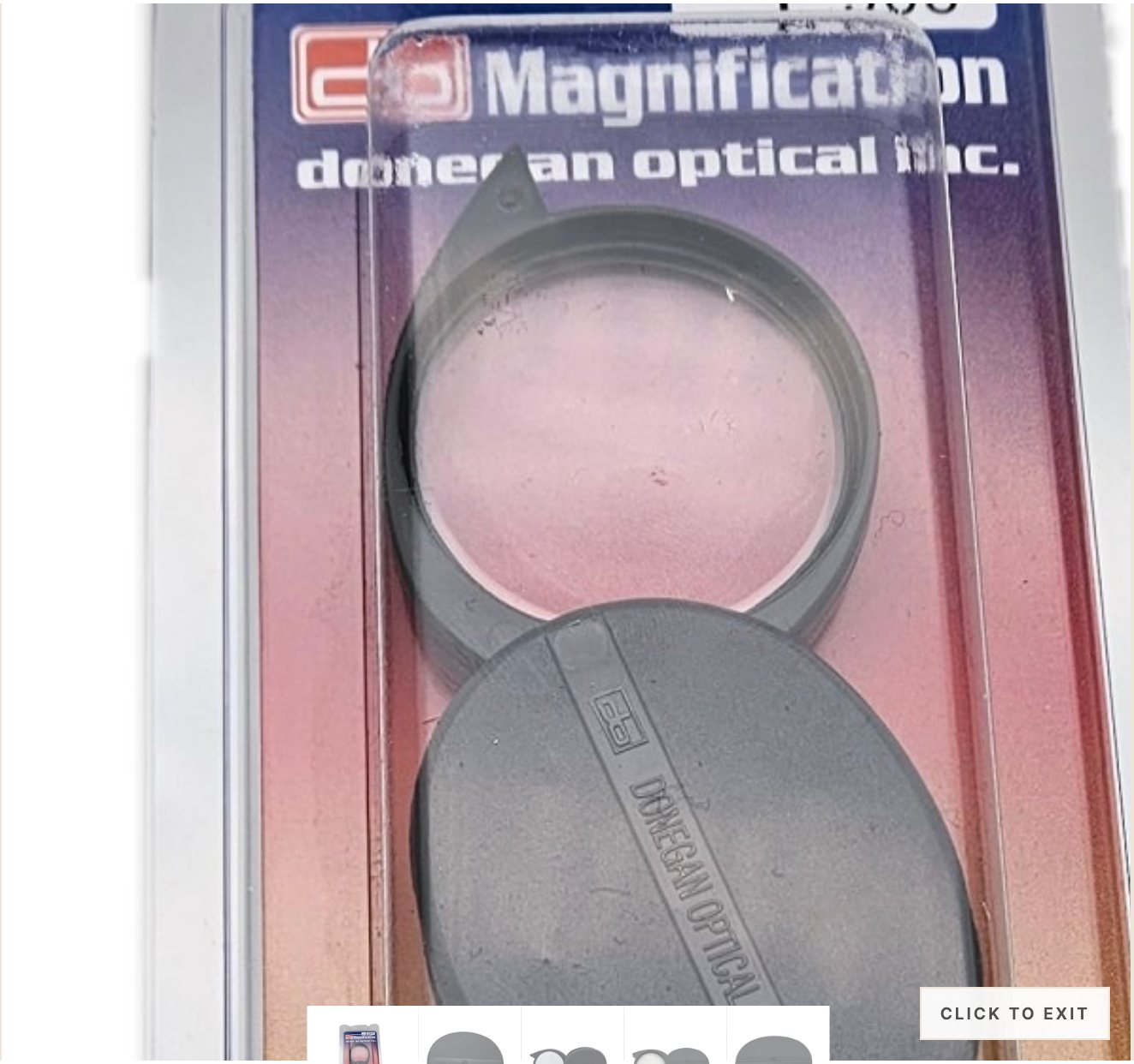
Take a closer look, at the actual photograph.
Click the image and an inspector magnifies the real product photo. The magnified pixels are the source image, not new product art, which matters for a customer choosing a loupe or a blade by the detail they can see.
Useful next steps, within reach.
Add a product and a drawer slides in with WooCommerce’s own mini-cart inside. Above the buttons: a progress message toward free shipping that reads the store’s live threshold from the shipping settings, so the copy can never drift from the real offer. Below it: three suggestions under Goes Well With, drawn from the product’s own links first and its category second.
The purpose of showing it here is to explain the design and behavior. There is no sales-lift claim attached to these screenshots.


A retailer’s expertise, given its own page.
Sharpening is part of what Heimerdinger is. Its page brings the service information and an inquiry form together with the same visual character as the shop, so the knowledge behind the counter has a place online, not a footnote.
Consistent product rows, category by category.
A catalogue of about a thousand products only looks like one store if the images agree with each other. This phase added atmospheric heroes to 149 subcategories and cleaned every Pocket Magnifiers product image at the source pixels with consistent framing, so a category row reads as a set.

The character carries through.
Checked at 1440, 834 and 390 pixels on September 20, 2026: one H1, no sideways scroll, readable buttons.


Read next.
The original Heimerdinger build
The first chapter: the WooCommerce store, live UPS rates, the Google Shopping feed and the move to my own server.
E-commerce website design
What I build for stores, from the catalogue structure to the cart.
The details that move an established website forward
A short guide, written from this phase, on improving a site without starting over.
Built in Louisville, for a Louisville institution.
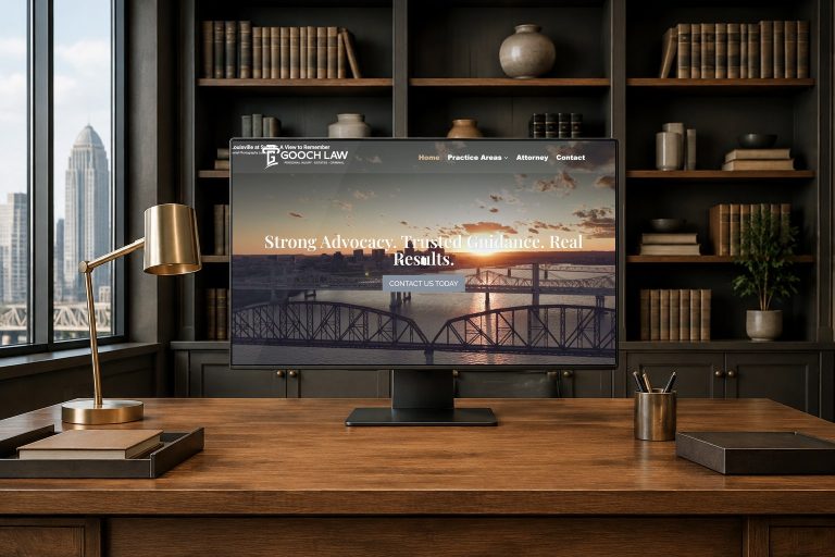
Shaun Wilson Designs builds, hosts and keeps improving websites for Louisville businesses. Heimerdinger is one of the longest relationships on this site, and this page is the second chapter of it. See web design in Louisville or WordPress maintenance for how the ongoing part works. The two device scenes on this page are presentation environments built from the real screens; the browser captures are the exact record.
Tell me what you are building.
One conversation, one builder, a clear next step. The person you brief is the person who does the work.