Data Centers Atlas: An interactive research website built to show the record and the evidence.
I built Data Centers Atlas to make a growing body of data center research easy to explore. A reader starts with the national picture, opens a state, searches for a company or county and inspects the sources behind any single record. Fifty state editions and Washington, D.C. share one map system, and every record carries its location basis and its evidence.
Or call or text (502) 387-1142
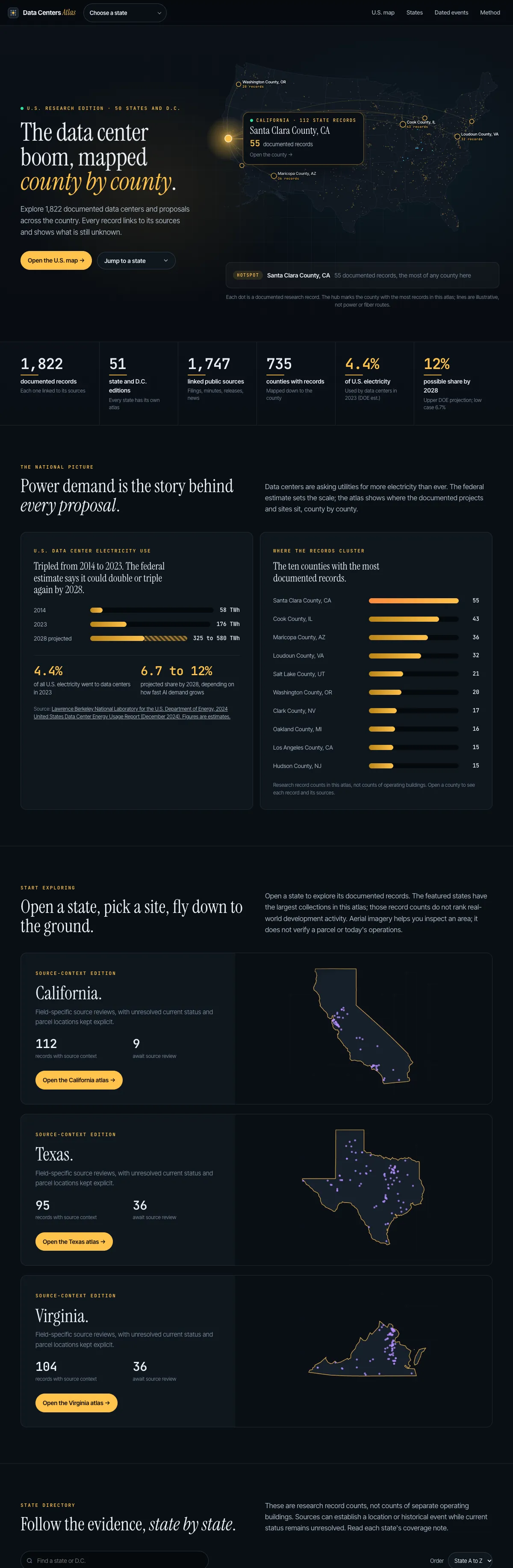

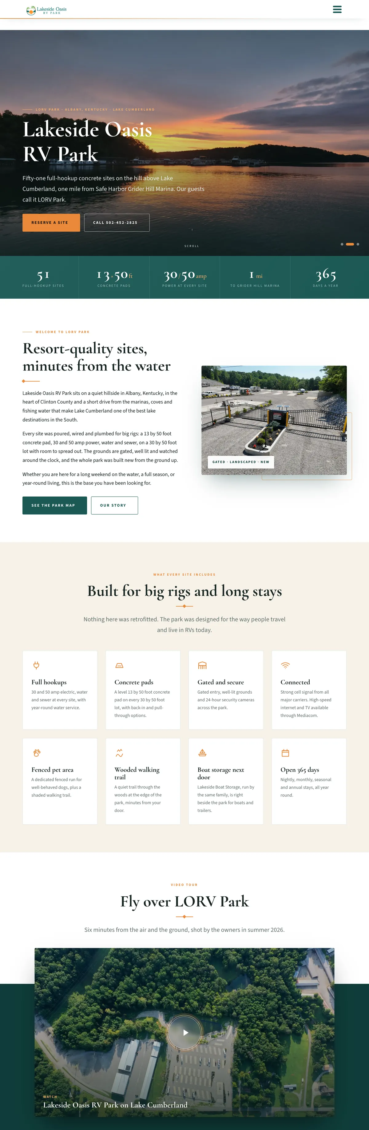


Websites I have built for Kentucky businesses



















Data Centers Atlas, a Shaun Wilson Designs studio project
50 state editions and Washington, D.C.
National and state maps, searchable records, source-linked detail views and a phone record sheet
Generated HTML, CSS and JavaScript with Python build tools and MapLibre, live October 15, 2026
Start with the national picture. End at the evidence.
Data center research is scattered across announcements, county minutes, filings and news reports. A spreadsheet can hold it, but nobody can read it. The Atlas turns that collection into a public tool with one central move: from a broad pattern, to a specific record, to the sources behind it.
The homepage opens on a full-width map of documented records with a route into the atlas. Below it, featured states, national context and an alphabetical state directory give several ways in, so a visitor can explore the overview or go straight to a place they already care about.
The October 15, 2026 edition holds 1,822 research records. That is a count of records, not a census of operating buildings, and the site says so. Being careful about what a number means is part of the design.
Exact screens, not mockups.
Direct browser captures of the live site at 1440 pixels. Nothing redrawn, nothing staged.


The work, piece by piece.
A national map with a record list
The map and a searchable, filterable list sit side by side, so a pattern and the records behind it stay on one screen.
Fifty state editions and D.C.
Every state shares one interface and visual system, with native state switching and a notes page for each edition.
Source-linked record views
Each record brings its status, location basis, facts, dated events and source links into one panel.
Location precision you can see
A published site, a street address, an approximate area and a county-level record are drawn and explained differently.
A phone record sheet
On a phone the records live in a bottom sheet over the map, so the map keeps its job and the text has room to be read.
A method page and downloads
How status, location and numbers are treated is written down, with data downloads and full provider credits.
Built for every screen it will meet.

research records in the October 15, 2026 edition, a count of records, not a census of buildings
map editions: all 50 states and Washington, D.C., on one shared system
status labels, each with one defined color and meaning
build system that generates every edition, page and data file
A research collection that reads like a product, with the evidence one click away.
Data Centers Atlas is live at datacentersatlas.com. The national edition brings 1,822 research records into one website covering every state and Washington, D.C., with the sources and the open questions kept visible.
The research continues as part of the product. Present operation, exact parcels, local rules and new dated events each need their own source work, and the structure is built to keep improving without hiding what is still open.
A map is only as honest as the record behind each dot.
So the record, the location basis and the sources travel with every point on the map.
Three decisions that shaped the site.

One system, fifty-one editions.
The Kentucky edition set the interaction and visual language. The national build carries that system across all 50 states and D.C.: one map interface, native state switching and a notes page for each edition.
Records keep stable identities, and the generated pages and data files share one structure, so a source or a status stays attached to its record as the site grows. The Kentucky research that started it is the Kentucky edition.
Give the evidence its own page.
A map pin can look more certain than the source behind it. The method page explains how the Atlas treats status, location, numerical claims and attribution, and the detail panel shows which kind of location each record has.
Approximate locations never become surveyed parcels just because a map can draw a sharp dot, and unlike power or investment figures are never added into one national total.


Put the timeline in order.
Votes, filings, approvals and announcements happen on specific days. The dated events page gives the published events a chronological view, each one linked back to its record and its source.
It is the same thinking behind every custom website I build: work out what a reader needs to understand, then design the shortest honest path to it.
Designed around the map and the record.
A phone cannot hold a map and a record panel side by side, so the records move into a bottom sheet the reader can expand, search and close. Navigation and state switching stay within reach at every size.


What people ask before building one.
Can you turn a spreadsheet or research collection into a website?
Yes. That is what the Atlas is: a structured collection of records turned into maps, search, record pages and downloads that anyone can use.
Does an interactive map website have to be built in WordPress?
No. The Atlas is generated HTML, CSS and JavaScript with Python build tools and MapLibre, because that suits a large data set. I build in WordPress when a business needs to edit pages itself.
Will an interactive map work on a phone?
It has to be designed for it. On the Atlas the records move into a bottom sheet over the map, so the map keeps its role and the text stays readable.
How do you keep a data map accurate?
By showing how sure each record is. The Atlas separates published sites, addresses, approximate areas and county-level records, and links every record to its sources.
Do you build map websites for businesses?
Yes. For a business example, see the Lakeside Oasis RV Park interactive site map, where guests pick a site and send a request.

What this project used.
Website design
Product structure, the visual system and a responsive interface built around the reader.
Interactive maps
Map interfaces that pair geography with searchable records, like the Lakeside Oasis site map.
Custom development
Generated state editions, data files and build tools made for this project.
Data websites, built in Louisville.
Shaun Wilson Designs is a Louisville web design studio. If you have a directory, research collection or body of information that needs to become a practical website, I can plan it around the people using it. Browse more website design examples. Every screenshot on this page is a direct capture of the live Atlas, made on October 15, 2026. The image at the top places real captures in a browser and a phone.
Tell me what you are building.
One conversation, one builder, a clear next step. The person you brief is the person who does the work.