
A 630-product WooCommerce store built around people, not categories
Five collections, an editorial hub and 664 indexed URLs, organised around the person buying the gift rather than the warehouse shelf it sits on.
Or call (502) 387-1142Or text (502) 387-1142Most online stores are organised the way a warehouse is organised: by what the thing is. Mugs here, shirts there, stickers at the back. That makes sense to the person shipping the boxes and almost none to the person buying a gift.
The Island Earth is organised the other way round. You do not arrive knowing you want a mug. You arrive knowing your dad fixes everything, your friend has a beagle, or your coworker will not stop talking about AI. The store is built to start from the person.
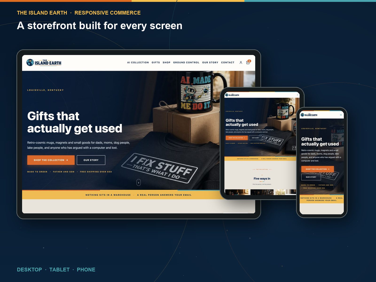
I built this one for myself, which is why I can show you everything. No client lets you publish their catalogue structure, the decisions that were wrong the first time, or the parts that only break at scale. This one I can. That makes it the most useful thing in my portfolio if your store is going to be large, awkward, or organised around something other than product type.
Five ways in
The homepage does not open with a category grid. It opens with five doors, and every one of them is a person rather than a product type:
- AI Made Me Do It
- Dad Life
- Mom Life
- Pet Collection
- Boat & Lake Life
A single mug can belong to three of them. The collection is the merchandising unit and the product is just the object that happens to carry the idea. The store says it plainly on the homepage: pick the person, not the product.
This is the part most stores get wrong. A category tree is an inventory diagram. Buyers do not think in inventory diagrams, they think in people they have to buy for.
630 products, and every one of them findable
The catalogue runs to 630 product URLs across five collections, plus an editorial hub and the usual pages, for roughly 664 indexed URLs in total.
At that size, the things that are invisible at thirty products become the entire job:
- Every product needs a title, description and image that stand on their own, because most are found directly rather than browsed to
- Collections have to overlap without generating duplicate content
- The sitemap has to stay clean or the catalogue quietly drifts out of the index
- Product images need one rule applied 630 times, not 630 separate decisions
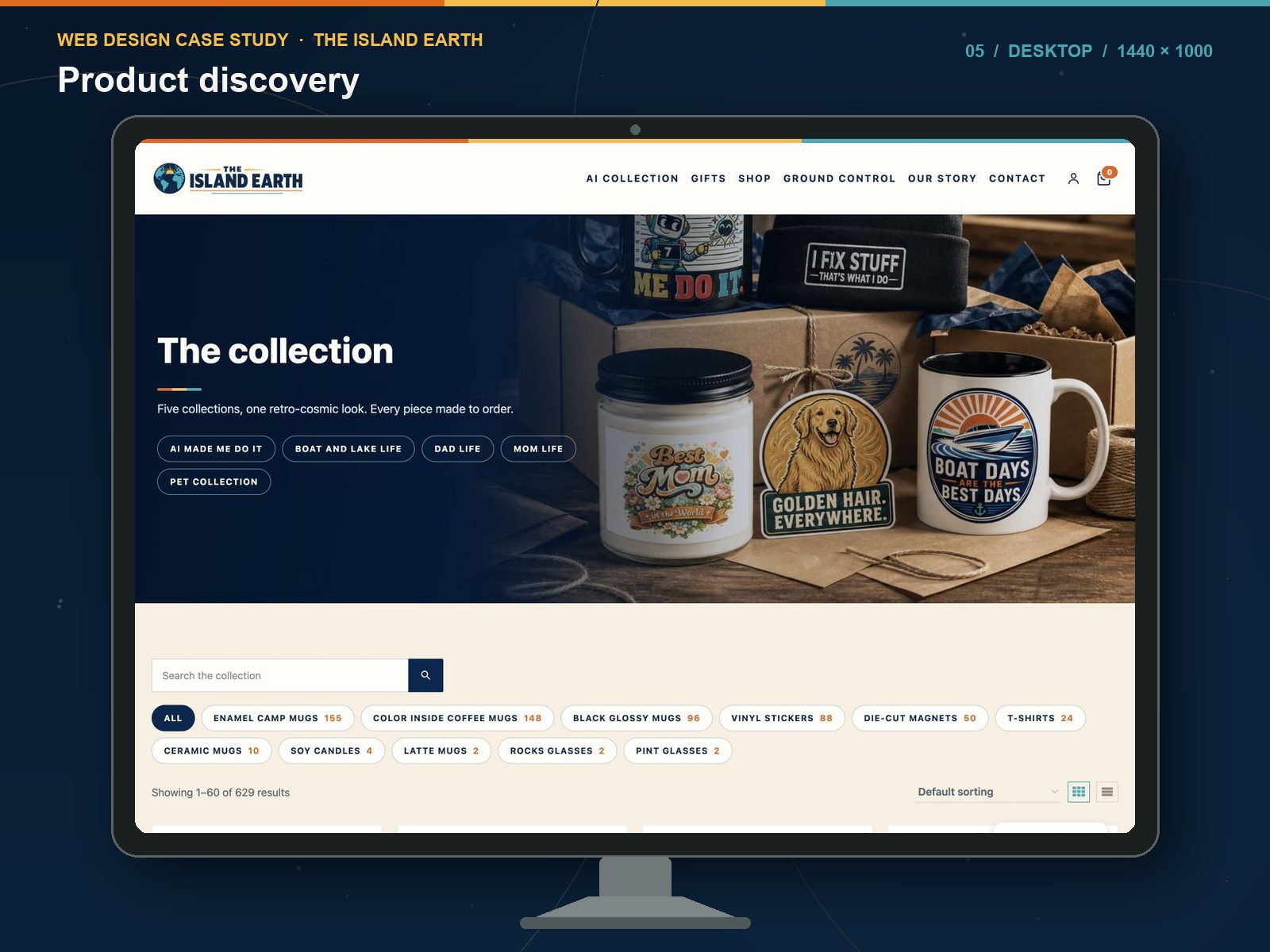
A gift finder, not a category list
Gifts in the navigation is not a category. It is a finder, built for the visitor who knows exactly who they are shopping for and nothing else about what they want. It is the most useful page on the site in the fourth quarter, and it only exists because the persona structure made it possible.
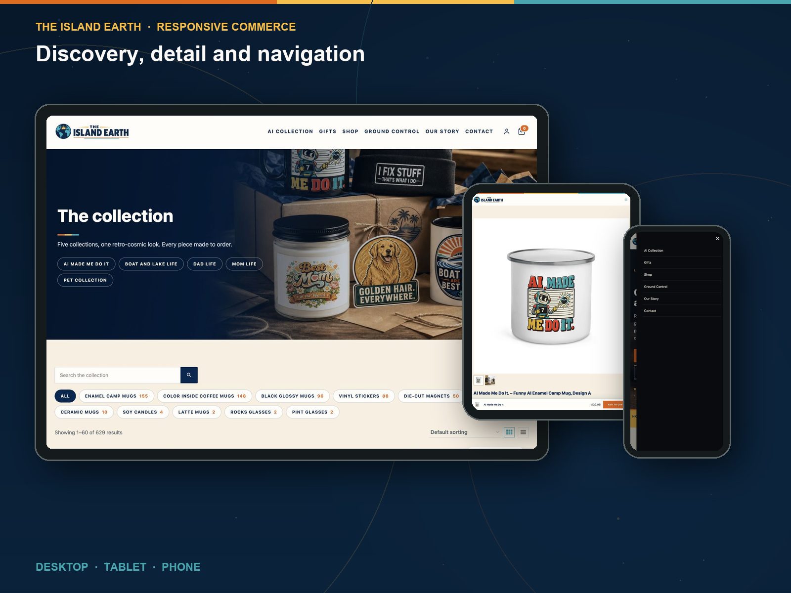
The product page has one job
Most people landing on a product page arrived from a search, not from the shop grid. They have never seen the brand before and they are deciding in about four seconds whether this is a real business.
So the product page carries the proof: consistent photography, plain description, clear price, obvious add to cart, and the reassurances that matter for a gift, which are what it is, when it arrives, and who to email when something goes wrong.
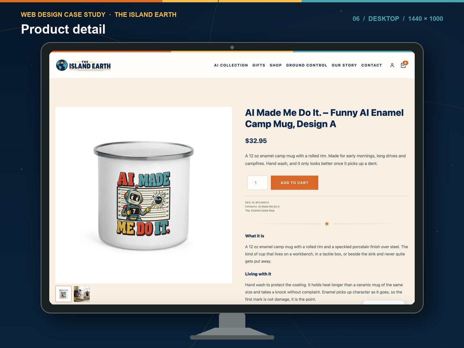
Ground Control: the store has its own newsroom
Ground Control is the editorial hub built into the storefront. It answers the searches that happen before anyone knows what to buy: gift guides by person, by pet, by job, by hobby.
This is the difference between a store that can be found and one that cannot. Product pages answer “where do I buy this exact thing”. Editorial answers “what do I get for someone who already has everything”, which is what people actually type into Google.
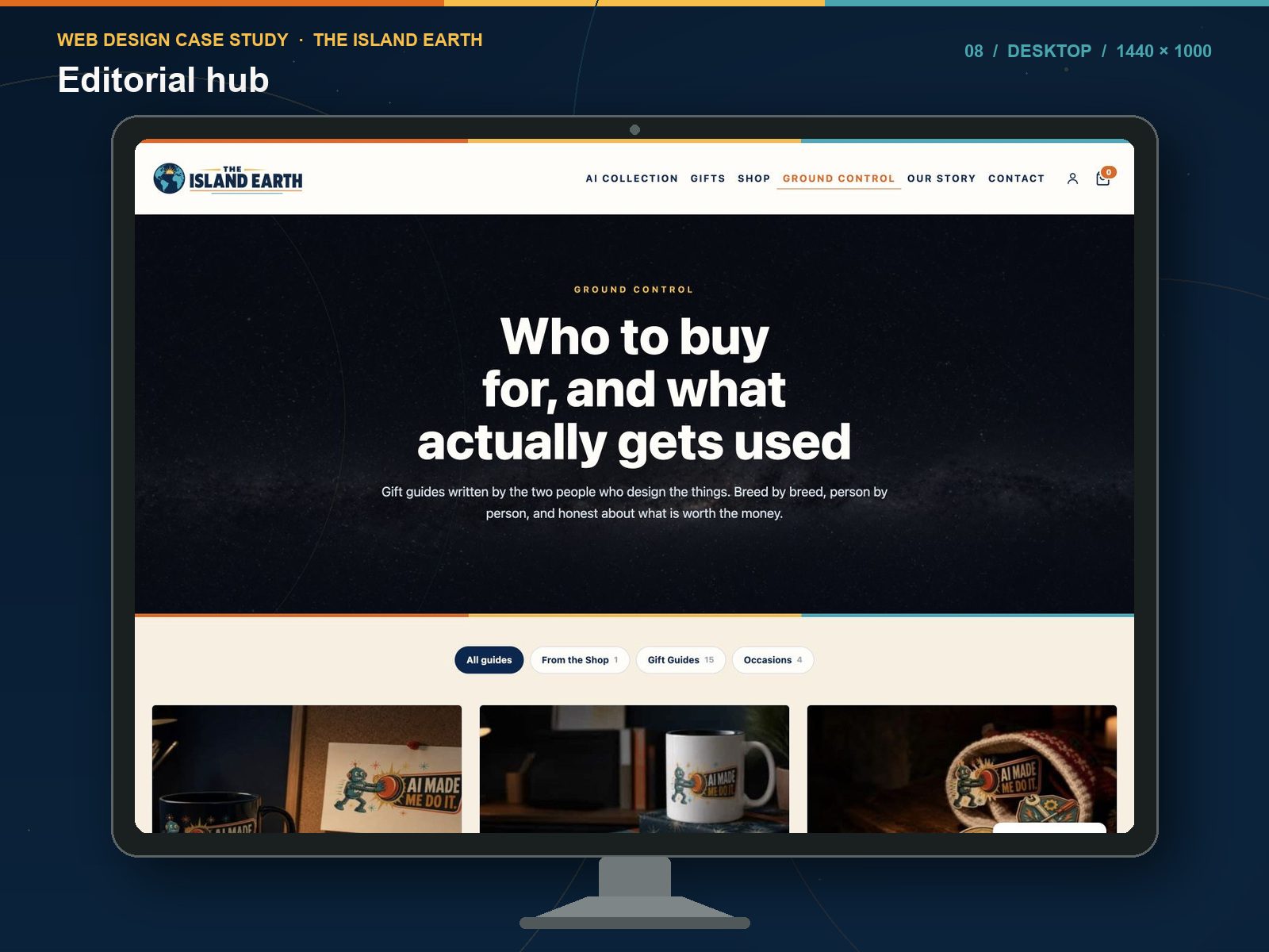
Built for the screen it lands on
Desktop, tablet and phone were designed as three behaviours rather than one layout that shrinks. The navigation collapses into a full-screen menu, the collection cards restack, and the product detail reorders so the price and the button stay above the fold on a phone.
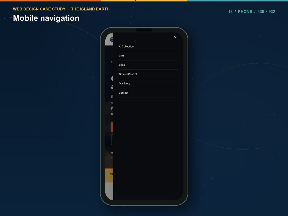
The brand had to hold it together
Six hundred and thirty products across five very different audiences will fall apart visually unless something holds them together. A single palette, one type system, and a story page that explains why a shop about dads, dogs and lake houses is called The Island Earth.
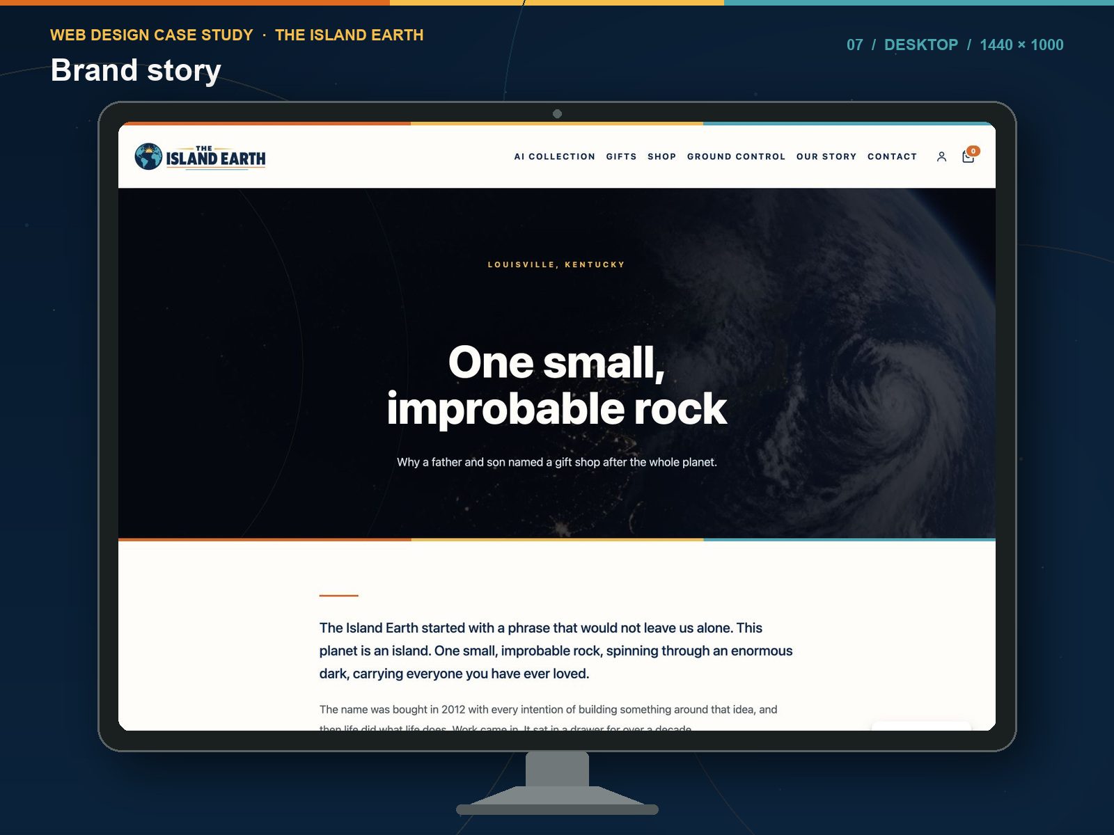
What is under it
- WooCommerce for the store, cart and checkout
- Kadence for the build
- Yoast for search and the sitemap across 664 URLs
- Printful in the supply chain
- GA4 for measurement
Nothing exotic. The work is not in the plugin list, it is in what was done with it at 630 products.
Why this one is in the portfolio
Not because it is pretty. Because it is operated. Orders, stock, product data, search performance and the parts that break at two in the morning, all handled by the same person who built it.
If you are planning a store with a large catalogue, an unusual structure, or content that has to earn its own traffic, this is the project in my work that maps to yours. I run a Louisville e-commerce web design studio, and if you would rather see the code side, there is more on custom WordPress development.